Multiple comparison graphs
| Command: | Graphs |
Description
Multiple comparison graphs allow to visualize differences between subgroups of a variable, or the influence of a qualitative (discrete) factor on another (continuous) variable.
The graph can be composed from different elements: Bars, Horizontal lines, Markers and or Connecting lines for mean or median, with choice of different error bars for mean (95% CI, 1 SEM, 1 SD, 2 SD, 3 SD, range) or median (95% CI, 25-75 percentiles, 10-90 percentiles, 5-95 percentiles, 2.5-97.5 percentiles, 1-99 percentiles, range), Box-and-whisker plot or Notched box-and-whisker plot, Violin plot, and/or Dot plot (display all data).
Required input
The following need to be entered in the dialog box: for Data select a continuous variable, and for Factor codes a qualitative factor. The qualitative factor may either be character or numeric codes. These codes are used to break-up the data into several subgroups.
When you want to use a continuous variable as the qualitative, discrete factor, you can convert the continuous data by using the Create groups tools.

Several elements can be selected to compose the graph, and some of these can be combined.
- Bars, Horizontal lines, Markers and/or Connecting lines for means or medians.
- Error bars: the following error bars are available if at least one of the graph types Bars, Horizontal lines, Markers and/or Connecting lines is selected:
If mean is selected: (none), or 95% CI for the mean, 1 SD, 2 SD, 3 SD, 1 SEM, and range.
- Note that 2 SEM is not in this list: when the number of cases is large, mean ± 2 SEM corresponds to the 95% confidence interval (CI) for the mean. When the number of cases is small, then the 95% CI interval is calculated as mean ± t * SEM, where t is taken from a t-table with DF=n−1 and area A=95%) (see also SEM).
- Although 1 SEM gives more narrow error bars, this option is not recommended since the resulting error bar may be highly misleading, especially when the number of cases in the groups is different. Preferably the 95% CI for the mean is used for providing a valid graphical comparison of means (Pocock, 1984), or use 2 SD as an indication for the variability of the data.
- When the number of cases is small, it is possible that the 95% CI for the median is not defined and that it will not be displayed in the graph.
- When you use percentile ranges, take into account the number of observations: you need at least 100 observations for 1-99 percentiles, at least 20 for 5-95 percentiles, at least 10 for 10-90 percentile and at least 4 for 25-75th percentiles.
- Box-and-Whisker plot (Tukey, 1977) or Notched box-and-whisker plot (McGill et al., 1978). A Notched box-and-whisker plot is a variation of the box-and-whisker plot in which confidence intervals for the medians are shown by means of notches surrounding the medians. If the notches about two medians do not overlap, the medians are significantly different at a ± 95% confidence level. For a detailed description of a Box-and-Whisker plot and Notched Box-and-Whisker plot, see Construction of a Box-and-Whisker plot.
- Violin plot. The violin plot (Hintze & Nelson, 1998) shows the density trace of the data. It is recommended to combine the violin plot with a box-and-whisker plot (select both options).
- When you select Dots (plot all data, all observations will be displayed in the graph.
The box-and-whisker plot in combination with dot plot has the advantage of displaying a statistical summary of the data (range, quartiles and median), without concealing the data.
If the data require a logarithmic transformation, select the Logarithmic transformation option.
Examples
Chart with bars representing the mean age of patients in a multicenter study.
'Error bars' represent 95% confidence intervals.

Chart with all data points for systolic blood pressure.
'Error bars' represent 95% confidence intervals.
A line connects the mean of the two treatment groups (coded 0 and 1).

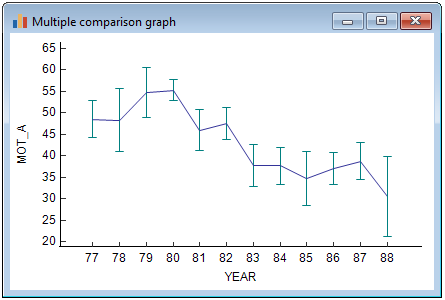
Chart with the evolution of sperm motility during 12 years.
The means for every year are connected by a line.
Error bars represent 95% confidence intervals for the mean.
Literature
- Altman DG (1991) Practical statistics for medical research. London: Chapman and Hall.
- Hintze JL, Nelson RD (1998) Violin Plots: A Box Plot-Density Trace Synergism. The American Statistician 52:181-184.
- McGill R, Tukey JW, Larsen WA (1978) Variations of box plots. The American Statistician 32:12-16.
- Tukey JW (1977) Exploratory data analysis. Reading, Mass: Addison-Wesley Publishing Company.
