Clustered multiple comparison graphs
| Command: | Graphs |
Description
Clustered multiple comparison graphs allow to visualize the influence of two categorical variables on another (continuous) variable.
The categorical variables may contain character or numeric codes. These codes are used to break-up the data into different subgroups.
The graph can be composed from different elements: Bars, Horizontal lines, Markers and or Connecting lines for mean or median, with choice of different error bars for mean (95% CI, 1 SEM, 1 SD, 2 SD, 3 SD, range) or median (95% CI, 25-75 percentiles, 10-90 percentiles, 5-95 percentiles, 2.5-97.5 percentiles, 1-99 percentiles, range), Box-and-whisker plot or Notched box-and-whisker plot, Violin plot, and/or Dot plot (display all data).
How to enter data
You need to enter data for one continuous variable (MEASUREMENT1 in the example) and 2 categorical variables (GENDER and TREATMENT in the example).

Required input

The following need to be entered in the dialog box:
- Data: a continuous variable that will be represented in the graph;
- Factor: a categorical variable that contains codes to break-up the data into subgroups.
- Define clusters by factor: a second categorical variable to make a second subdivision in the subgroups.
- Select: a filter to include only a selected subgroup of cases in the graph.
- Graphs:
- Bars, Horizontal lines, Markers and/or Connecting lines for means or medians.
- Error bars: the following error bars are available if at least one of the graph types Bars, Horizontal lines, Markers and/or Connecting lines is selected:
If mean is selected: (none), or 95% CI for the mean, 1 SD, 2 SD, 3 SD, 1 SEM, and range.
- Note that 2 SEM is not in this list: when the number of cases is large, mean ± 2 SEM corresponds to the 95% confidence interval (CI) for the mean. When the number of cases is small, then the 95% CI interval is calculated as mean ± t * SEM, where t is taken from a t-table with DF=n−1 and area A=95%) (see also SEM).
- Although 1 SEM gives more narrow error bars, this option is not recommended since the resulting error bar may be highly misleading, especially when the number of cases in the groups is different. Preferably the 95% CI for the mean is used for providing a valid graphical comparison of means (Pocock, 1984), or use 2 SD as an indication for the variability of the data.
- When the number of cases is small, it is possible that the 95% CI for the median is not defined and that it will not be displayed in the graph.
- When you use percentile ranges, take into account the number of observations: you need at least 100 observations for 1-99 percentiles, at least 20 for 5-95 percentiles, at least 10 for 10-90 percentile and at least 4 for 25-75th percentiles.
- Box-and-Whisker plot (Tukey, 1977) or Notched box-and-whisker plot (McGill et al., 1978). A Notched box-and-whisker plot is a variation of the box-and-whisker plot in which confidence intervals for the medians are shown by means of notches surrounding the medians. If the notches about two medians do not overlap, the medians are significantly different at a ± 95% confidence level. For a detailed description of a Box-and-Whisker plot and Notched Box-and-Whisker plot, see Construction of a Box-and-Whisker plot.
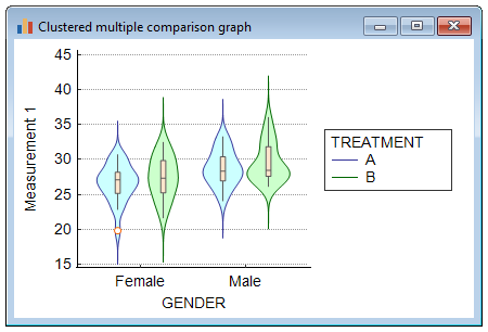
- Violin plot. The violin plot (Hintze & Nelson, 1998) shows the density trace of the data. It is recommended to combine the violin plot with a box-and-whisker plot (select both options).
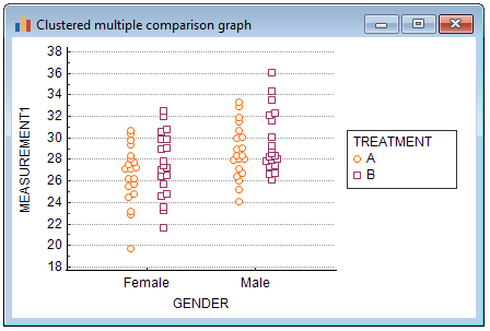
- When you select Dots (plot all data, all observations will be displayed in the graph.
- Options: if the data require a logarithmic transformation, then select the Logarithmic transformation option.
Examples
Bars representing means with error bars representing 95% confidence intervals:

Violin plot:
This is an example of a graph with option "Dots" selected:
Literature
- Altman DG (1991) Practical statistics for medical research. London: Chapman and Hall.
- Hintze JL, Nelson RD (1998) Violin Plots: A Box Plot-Density Trace Synergism. The American Statistician 52:181-184.
- McGill R, Tukey JW, Larsen WA (1978) Variations of box plots. The American Statistician, 32, 12-16.
- Tukey JW (1977) Exploratory data analysis. Reading, Mass: Addison-Wesley Publishing Company.
